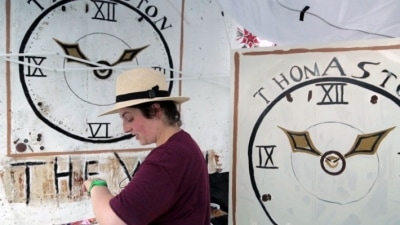
 In December I had the opportunity to attend several of the Miami Art Fairs. This was an amazing experience that allowed me the opportunity to see an amazing array of work from around the world that are created using some of the most unusual processes. When I first came upon David Knuth’s work at the Untitled show in Miami I was drawn to the simplicity of the images. They appeared to be large areas of gradating color fields that met at a sort of horizon line. They seemed to fall somewhere between a landscape and abstraction. To me they had a simple beauty to them. Upon closer inspection, Knuth appeared to have used a pointillism technique to create these large paintings which seemed rather labor intensive considering the scale of the work and the size of the small dots that composed it. As I was examining his paintings I overheard the gallery curator explaining to a potential customer how Knuth created the works – with a little help. As it turns out, Knuth enlists the help of hundreds of thousands of house flies! Knuth feeds the flies a concoction of sugar water and watercolor paint. The flies are contained to particular areas on the painting where they then regurgitate the paint onto the surface of the painting creating these tiny dots of color. The mark is called a flyspeck. The paintings are comprised of millions of little dots created by the flies all over the surface of the canvas. Although the artist does controls what colors the flies use, and what area they have access too, he also leaves quite a bit to chance when depending on his many assistants. The lesson I learned was to inquire! Although you may think you have an idea how something is made, you may very well be completely shocked to find out how misinformed you really were. When I ran into a friend later and told her about Knuth’s work she didn’t believe me until she spoke to the gallerist herself. I don’t know that I would ever use flyspecks in my work – at least not on purpose, but it was a very interesting lesson about the techniques and processes artists use.
0 Comments
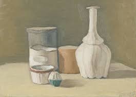
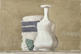
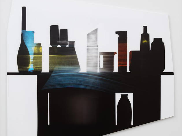
A while back one of my professors suggested that I look at the work of Giorgio Morandi. Morandi is an Italian painter and printmaker primarily known for his simple tonal still life paintings of nondescript, everyday household items. He would often paint bottles, bowls or vases that could be found in any home, taking something seemingly irrelevant that anyone can relate to and putting it in a place of importance as the subject of the painting. His paintings are very simplified, not only in subject, but also in his approach. Morandi uses a limited palette with such subtle shifts in tone, often given them an almost flat appearance. This flatness is one of the reasons I really struggled to understand why my professor had suggested that I look at his work. I tend to use a full range, and often emphasize the variations of light and dark in my paintings.
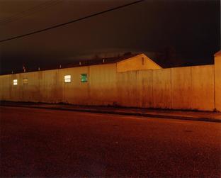
Ironically, when I was researching Uta Barth last week I found that she was heavily influenced by the work of Morandi, so I revisited his work. I find that since I have been breaking my images down and concentrating more on the individual parts of the whole I can better relate to the style of artists like Morandi. I still love the rich textures that I can achieve using strong chiaroscuro affects, but I can also appreciate subtle tonal images like those of Morandi. A small shift in value can imply a softer presence of the subject as opposed to attempting to force the subject into the viewer’s world. This can be very appealing in a time when everything is so busy and over-stimulating. So many artists today just seem to be trying to do as much as possible in the space they are working perhaps hoping that something will stick. I love that Morandi’s work is what it is, and that he didn’t seem to feel he had to make it any more complex in order to impress the viewer. I also enjoy Morand’s simple subjects. I understand that he would work very hard to achieve the right balance in his compositions, but they emanate a sense of quiet and serenity that really appeals to me. I find that my recent approach to my work seems to lend itself to more simplified subjects which also happen to be overlooked. It’s nice to see an artist who does this. Morandi’s style is simple and painterly. His name has come up twice more in conversations this week, so I plan to continue to study his work and hope it will influence what I am doing. This week I want to talk about a couple of photographers whose work I have been interested in. While I enjoy taking pictures of interesting places and things, especially when the light hits the subject "just right," I have never been able to view myself as a photographer. I don't know quite why that is. It probably has to do with the fact that I often feel compelled to later paint the image I photographed. As I was doing some research for recent paintings I came across photographer Todd Hido's work. While Hido works with a variety of subjects, I find myself intrigued by his vacant interiors and obscure exteriors. I have also been directed to look at the work of photographer Uta Barth's very simplified images which exude an abstract beauty that tends to be less common in photographic compositions.
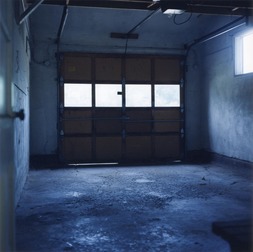
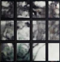
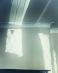
I’m not sure what it is that attracts me to Todd Hido’s work. Perhaps the ambiguity of the subjects is something that intrigues me. Many of his exteriors are random apartments or houses that are photographed at night. There isn’t anything extraordinary about them – they could be any house in any neighborhood that you’ve driven past a thousand times. Many of the works that interest me are shots with dramatic lighting and a sense of atmosphere that is created with a combination of color and light. One of the physical qualities that results from his use of light is a sort of simplification of the subject. The buildings and vehicles become more like basic shapes with an emphasis on some of the extreme lights and darks. These physical characteristics result in ambiguous images that can leave much interpretation up to the viewer. 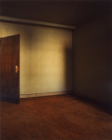 Hido approaches his interior photos in much the same way. They aren’t about what’s there, but almost more about what is missing. Dingy empty rooms. Is your glass half empty, or half full? Is this a place that is full of anticipation and hope, or of sad memories and broken dreams? It’s nothing, but every viewer walks away seeing and feeling something different. As one who likes to paint spaces like this I enjoy the various levels of information. There are dark areas that seem void of information or like something is hidden there, other places have piles of dirt, or trash that create small areas of visual interest, and often there are empty windows that fall somewhere in between. To me so much of his work relies on the mood of the viewer. The images could easily be regarded as irrelevant common areas. They could be viewed as voyeuristic and creepy, or they could also be seen as nostalgic and beautiful. As one who has always been intrigued by the play of light and shadows, I feel this is one of the primary things that attracts me to both Hido’s work, and that of photographer Uta Barth. Barth uses a different approach to her work, but accomplishes many of the same effects. Like Hido, Bart also uses light and shadow to create important compositional elements in her work. Many of her photos are entirely, or almost entirely about the shapes created by shadows. While some of her work includes parts of the photographer like a hand holding a curtain, or a foot at the bottom of an image where the shadow of a body is cast, I feel that her most successful work happens when the image remains more ambiguous and just allows the shadows to create lines and patterns. A fan of Morandi's still life work, Barth also has a series that utilizes the reflective qualities of colored glass bottles reflected on a wall to create her images.
Uta Barth
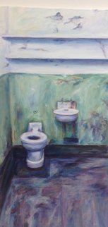
I find her use of indirect images intriguing. I am one who has always appreciated these images myself, but haven’t seen them represented as the primary subject of artwork this way before. Like Hido, Barth uses parts of common images to create beautiful minimal work. Her simplistic subjects sometimes reveal themselves, but other time they remain obscure. I think the simple lines and soft lines are what make her photos quite unique. Typically photography provides clear realistic images as opposed to those modifies by a painter, but Barth manages to use photography to capture very minimal abstract compositions that often require the viewer to look a little longer to work out the details. 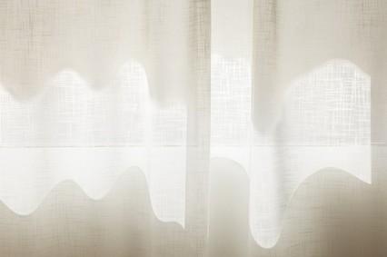 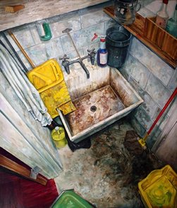 Amer Kobaslija, Janitor's Closet Before grad school my artistic focus was typically on things that I felt people wanted to look at. Things that made them feel good. Although I can find aesthetic beauty in some pretty obscure places, I never thought others would be interested in paintings of these things, so I stayed with subjects I felt viewers would be more comfortable with. Last semester when I began to juxtapose images that were in close physical proximity, but vastly different in subject, I found that my peers and professors alike were more interested in the less romantic subjects that I typically cast aside. This new exploration of what I perceive as "unwanted" spaces has led me to paint images of both interior and exterior spaces that lead the viewer to pause and reconsider those things that they may look past everyday that actually hold an element of interest upon closer examination. One of the artists I was referred to Amer Kobaslija. Ironically, after looking into his work I attended a presentation at a SECAC conference in October where one of the presenters was an art historian talking about Kobaslija's work. While it would have been exciting to meet him personally, it was interesting to learn a little more about his background and his work. Kobaslija is a Bosnian artist who fled to south Floriday in 1997 with his parents. His work is typically based around what he refers to as "places and spaces" - interiors and exteriors. Many of his interiors are dirty, messy, cluttered spaces. He even did a series of public restrooms that I found interesting since one of the paintings I did last semester was a dirty bathroom that received a very positive response in spite of my doubts about the subject. his exteriors are often desolate ruined landscapes. One would think that, as a refugee, he would focus on the ravages of war, but he doesn't, at least not in any literal sense. He has done work depicting the destruction following disasters like hurricanes, but his work usually doesn't include human figures, and tend to focus on the destruction of the landscape as opposed to making any kind of political statement. Kobaslija's approach to his subject is very energetic and actively invites the viewer to pause and explore the space he is depicting. He uses loose painterly brushstrokes to create a very active, detailed painting. His works vary in scale from several feet across to just a few inches, but regardless of the scale he manages to keep his viewer engaged in the work. Kobaslija often uses either a birds-eye view or a distorted fish-eye perspective that distorts the view of his interiors and creates interest. While many of his paintings show very cluttered spaces, and force the viewer to explore the canvas almost like a scavenger hunt, I find that some of his more recent work is very similar to the spaces that I have been painting - simple and empty, yet still beautiful. He manages to create interesting compositions with simple every day spaces. 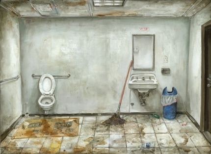 Amer Kobaslija, Chelsea Restroom V 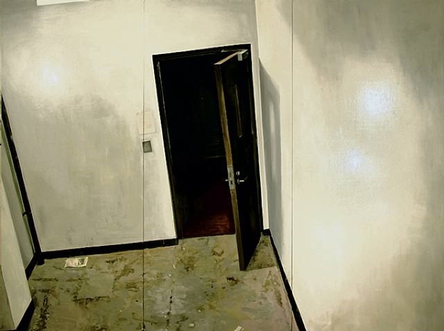 Amer Kobaslija, Door View
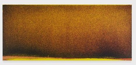
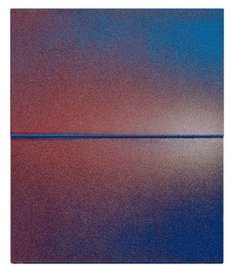
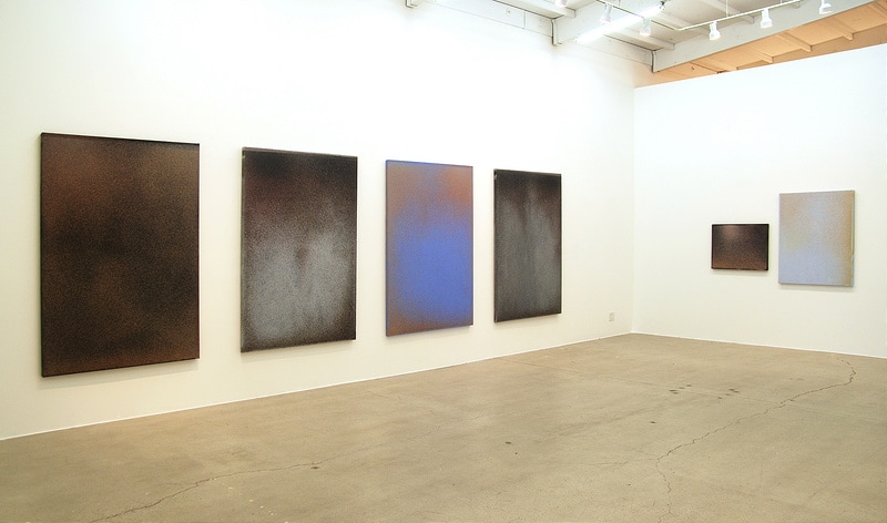
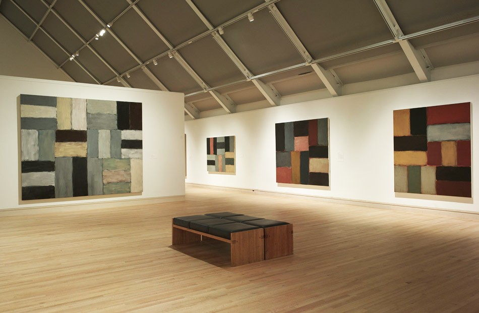 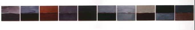 Sean Scully Art Horizon III Last semester in my Contemporary Art History class I learned about an artist named Sean Scully. We watched an Art 21 segment that started with him talking about his move from Ireland to Germany and how inspiring the landscapes were to him and his work. He continued about how he used to paint form the cityscapes in Ireland but he couldn't help but be moved by the landscapes that now surrounded him. He was fascinated with the colors, and the components of the scenes. At the time I wasn't familiar with his work, so when they moved to a scene of him working in his studio I was quite surprised to see that he is a colorist. At the time I wasn't really sure how I felt about his work. I often find it difficult to relate to minimalist work. Scully works on a huge scale with large blocks of color. He often creates patterns, especially checkerboard patterns that Scully relates to both the landscapes, and the current culture of his homeland, Ireland. In his previous work Sully would mask off the color blocks creating hard edges, but in his current work he leaves softer edges, allowing the colors to overlap. In December I had the opportunity to see Scully's work first-hand at Art Basel in Miami. The scale alone was impressive. Having been exposed to his work just a few weeks earlier made me take pause to look more closely. Although I still didn't truly understand his work, I did have an understanding of his background and inspirations which made it more relatable. When I considered it more in terms of an impressionist painting it made more sense. While he is inspired by his surroundings, he breaks the images down to the most basic elements of colors. Last week we had a visiting artist who looked at my more recent work and related the individual panels to Scully's work. Until she pointed tis out, I never made the connection, but many of the individual panels do in fact resemble his work. At this point my plan is to work on the grid to create an image that I can relate to, then line the individual panels up creating an entirely new whole using the same components. The individual panels then become almost as important as the unit as a whole. I suddenly have a renewed interest in his work and feel his approach to his work can probably influence how I look at the individual panels I am working on. 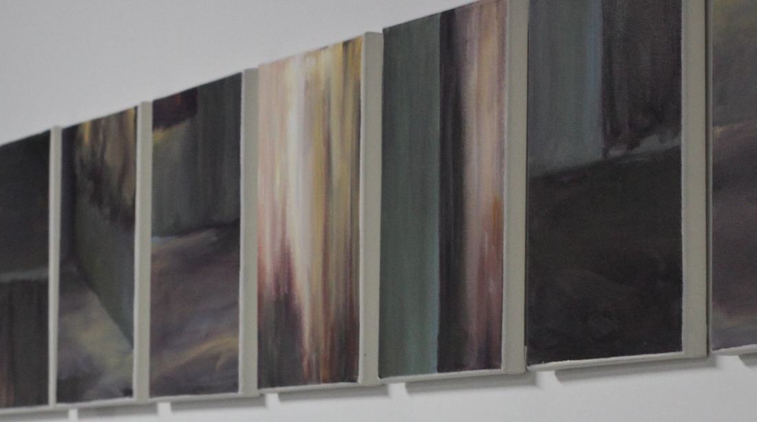 Cyndy Epps, Empty Spaces
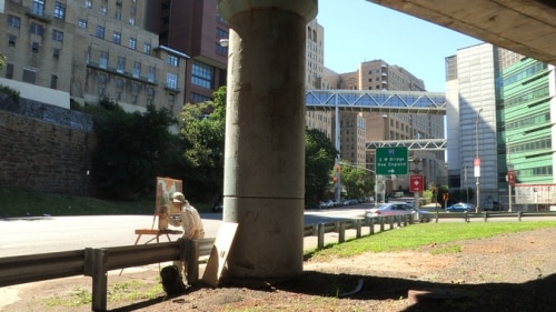
Through the years when I have taught drawing classes my students often finish the class saying that they see the world around them differently than they used to. They notice things they never even realized were there before, whether an actual object, or part of a landscape, or sometimes simply a shadow that is cast. We are often in such a hurry as we go about our business that we rush right past the world around us, and never notice the beauty that lies right in front of us every day. I suppose as artists we have more of a tendency to notice things. We also tend to find beauty in things that others may consider useless or ugly. Since my recent work is focusing more in finding beauty in these overlooked, or discarded places and objects, I have been researching artists who do the same like Rackstraw Downes and Josephine Halvorson. Interestingly enough, both Downes and Halvorson work plein-air which means that they actually work outside and from life as opposed to using photographs as reference. My schedule has never really permitted me the time to do this, but the more research I do, the more I realize that a lot of the work I admire has in fact been created using this method. One of the primary differences between the approaches of these two artists is that Downes will revisit a location every day for months to complete a single painting, whereas Halvorson sets out early in the morning and typically completes her work in a single day regardless of how long it takes. I can see how setting those parameters to essentially, "not leave until it's finished," can help you to focus and complete a painting, but there always seem to be interruptions. Until I can with certainty set aside an entire day to paint, I will refrain from imposing those parameters on myself. I would however love to work plein-air at some point and see what approach works for me.
Although both Downes and Halvorson work from life, they each have a way of "cropping" a snippet of the world around them to create an interesting composition in their work. Downes tends to focus on a broader subject. He typically creates desolate landscapes and street scenes: sometimes urban, sometimes rural. His work often includes abandoned buildings, or the underside of overpasses and bridges which add visual interest to his work. His intricately detailed compositions seem to compose the elements of everyday life in a way that makes the viewer sit up an notice the beauty in the overlooked. It may be the starkness of an empty building in a field in the middle of nowhere, or how the curve of an overpass frames a busy street below, but Downes seems to be able to make the viewer more keenly aware of the environment around them. 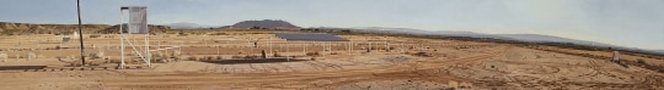 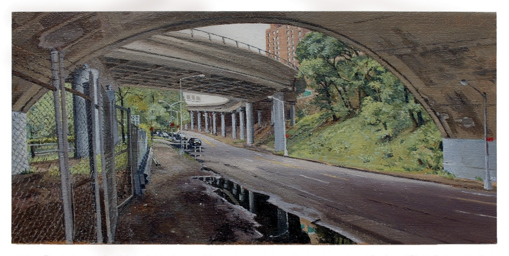 Like Downes, Halvorson works with both rural and urban subjects capturing the essence of her subject. While Downes' focus is on a broader scale, Halvorson hones in on her subject, braking it down almost to the point of abstraction. She will find a small portion of her subject that captures her interest and leave the rest to the imagination. Both artists work in fine detail, but while Downes captures a scene, Halvorson crops her image down to a small detail that she enlarges to the point that is becomes simply a collection of colors and shapes. I relate to her work on many levels.
One of the projects I often included in my drawing classes was trip to a scenic area on the Savannah River in Columbia County, GA. My students would arrive with feelings of being both excited and overwhelmed. We would usually plan these trips on a beautiful day in either the spring or fall, so everyone was eager to sit outside and work rather than sitting in the classroom working from a still life. Upon arrival though, they were often overwhelmed but the vastness of the landscape. I would then direct them to notice those odd little things like a drain pipe with an awesome shadow, or a particular rock with multi textured plants growing around it, etc. that they never really considered when they were engrossed in the vast scene before them. Both points of view are of the same subject, but focus on something very different to create beautiful compositions. This is how I feel about the work of Rackstraw Downes and Josephine Halvorson. Both work with over-looked subjects using a detailed painting approach but focus on different views of their subject. 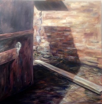 I feel that my work fits in between these artists somewhere. I am exploring similar subjects as both: the over-looked, alleyways, abandoned deteriorating buildings, places that don't necessarily seem pretty at first sight, and may even be uncomfortable if you were actually there. But I paint them in a way that makes you reconsider their aesthetic significance. I am not painting as broad an area as Downes, but I do find myself drawn to a lot of the same intimate details of subjects that Halvorson seems to focus on. When I paint on a grid of canvases and later break the image down I am honing in as close or closer to my subject as Halvorson which really emphasizes the textures and colors that compose that detail of the subject that seems so rich. Using the grid seems to allow me to create the whole image, but then later select smaller abstractions the seem to interact with each other in a way that I may not have noticed while I was working on the whole. Seeing other artists that work in a more realistic technique and using similar subject matter to what I am currently focusing on, inspires me to continue exploring where this line of inquiry may lead. 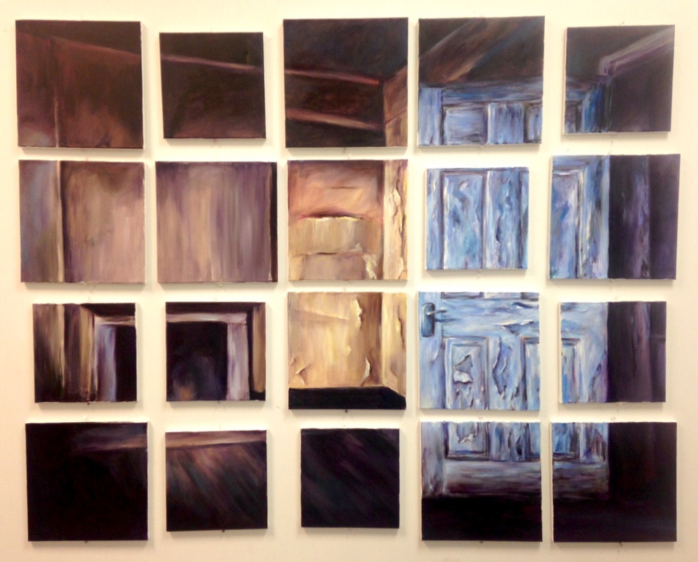 |
Cyndy EppsWorking on my MFA in Studio Art at Georgia Southern has taught me the importance of understanding not only what I am doing as an artist, but also what other artists are doing, and how that can impact my artwork. Archives |


 RSS Feed
