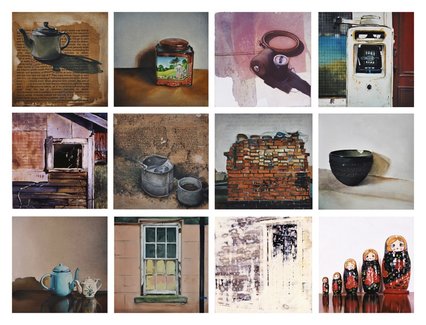
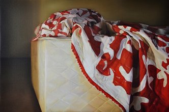
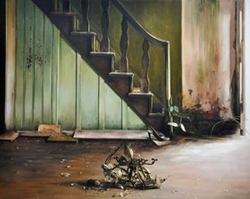
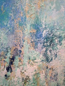
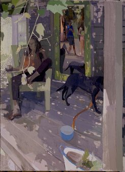
 Jennifer Trouton is an Irish artist who seems to find inspiration in many of the same mundane spaces and things that I find beautiful as well. In addition to similar subjects, Trouton has also explored many of the same uses of space and surface area that I have been working with. She has several pieces that are composed of a number of gridded panels, as well as diptychs. While the objective of these blog posts is to find artists who inspire us, it's strange to come across someone who has followed a lot of the same paths that I have. In Trouton's work, "Looking at the Overlooked," she explores the traditional idea of still life in a contemporary way. The piece comprises of 304 small works on board. Text and photographic images appear throughout the piece blending seamlessly with painted images. True to the tradition of still life, the completed works have a strong attention to detail with their subjects referencing the world of the every day life. Trouton says of the work, "unlike my predecessors, I am not interested in that which is stereotypically beautiful. Instead, attention is given to routine spaces and the discarded commonplace objects of our quotidian existence. Images more fitting for the excessively commercial and profligate society we occupy today were commodity replaces commodity with a ceaseless rapidity; respect for and need of tradition and time honoured craftsmanship is negligible." 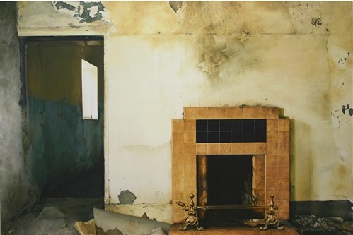 In addition to her still life paintings of the mundane, much of Trouton's work is also about rural Irish life, traditions and deterioration. She has created many works that address the deteriorated structures and homes in the Irish countryside. These subjects resound with my own attraction to deteriorating buildings and abandoned spaces. There is just something intriguing about the dichotomy of hope and hopelessness in a deteriorating structure. 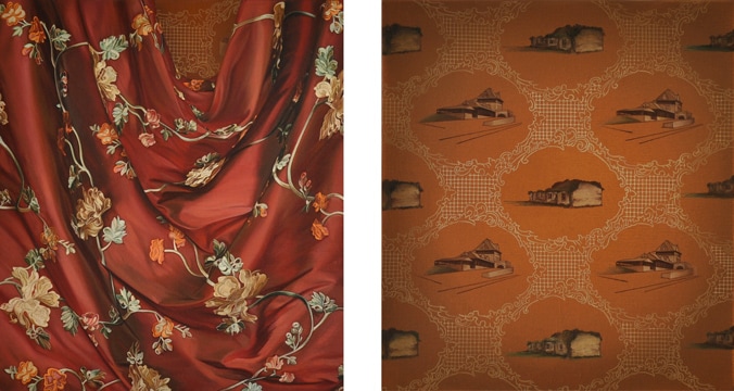 Trouton also has a series that included diptychs of patterned wallpaper paired with draped fabric that are reminiscent of growing up in the Irish countryside. Although my approach to the space of the canvas is different, these pairings also offer similarities to the bed painting I recently completed. I suppose that is due to her use of two canvases, draped fabric, and dual images to tell her story. My initial idea for the bed painting was a traditional diptych similar to Trouton's approach, I decided to splice the images together and create slightly off-kilter spaces between the images to diminish the feeling of stability in the work. My work can be seen below. 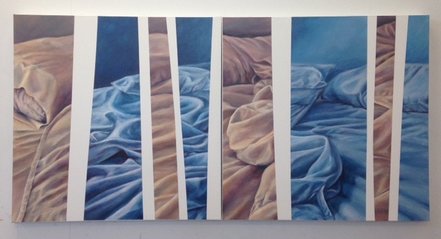 Troutons use of mundane spaces and objects seem to act as a prompt for the viewer to reconsider the subject and thus draws the viewer in to explore not only the image itself, but how it what it reminds them of and how it makes them feel. At the same time her images could feel lonely and desolate - things left behind, or quiet and comforting - reminders of a simpler time.
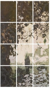 As I mentioned before, Jennifer Trouton not only works with similar subjects, but also explore the idea of multiple canvases, just as I have. Sometimes she does this by including numerous panels with similar subjects on each, and other times she creates a window from the panels by spreading the image out over the surface of multiple canvases. While I can't honestly say that my work has been influenced by, or inspired by Trouton's work, I can say that it's nice to see that someone has been successful thinking in much the same way as I have, so maybe there is hope!
0 Comments
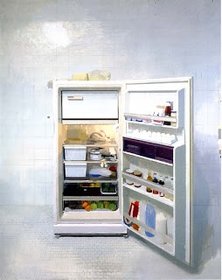
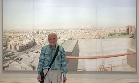 This week one of my professors introduced me to the work of Antonio Lopez Garcia. Garcia leads a group of Spanish Realists who typically work from life and depict things that are often considered commonplace. While at first glance Garcia's work looks photo-realistic, upon closer inspection the viewer can often find that while there are areas of precise detail, there are also areas of looser, more painterly brushstrokes that add character and interest to his work. When you look at his "Open Refrigerator," you can't help but notice his attention to detail, but when you look closer you notice that the side of the refrigerator door is simply implied or suggested.
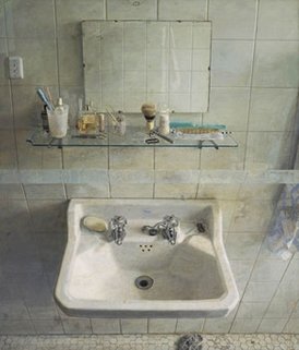
Garcia represents real spaces that are truly interpretation of the space and time. Because he paints form life, his work is created over a period of time, so the light is always changing. This requires him to make decisions about how he will represent the light in his work. Often, like in "Sink and Mirror," he will also slightly distort the image to create a more dramatic affect.
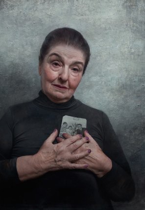
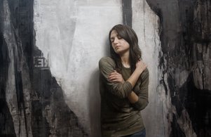
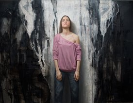
I find Garcia's approach intriguing. I am drawn to his subjects and the common ugliness that makes so many of them absolutely beautiful. The way Garcia represents his subject is also something that I appreciate. I would never consider myself a photo realist, I don't think I have the patience for that, but I do love to create areas of intricate detail that are complimented by areas that are more painterly. This was a quality I always admired in the work of John Singer Sargeant, and, while Garcia is more of a realist, I feel that those qualities still exist in his work. While researching Antonio Lopez Garcia I came across an article called "Artists on Art - Antonio Lopez ," by artist David Jon Kassan written in November of 2012. While in Madrid Kassan actually visited the studio of Garcia and even had the opportunity to paint his portrait while he was there. After reading the article I was intrigued and had to look up Kassan's work. He uses a very similar technique to create his portraits, using amazing realism partnered with some looser, painterly areas. But the realism he achieves in the flesh tones is uncanny. His life-size portraits capture the wrinkles and veins of his subjects, but he also capture the personality and emotion of his subjects in a way that completely draws the viewer in.
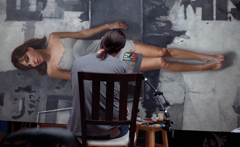 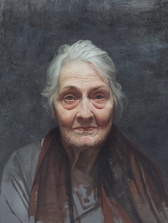 Kassan says, "My work is a way of meditation; of slowing down time through the careful observation of overlooked slices of my environment.”
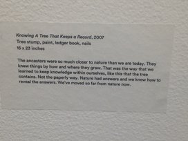
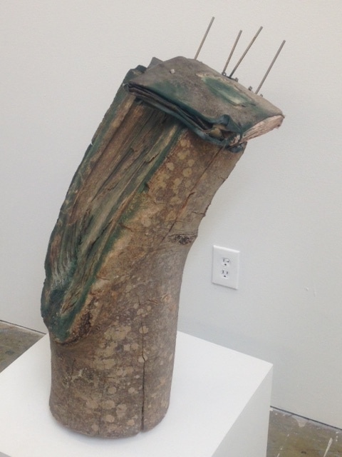
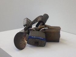
Many of Kassan's backgrounds are rough, deteriorating walls that echo the changing, and aging of his subjects. Kassan says, "Time is an unbroken continuum of experience, change, growth and decay, and both subject and background are visceral embodiment of this process." Kassan’s inclusion of urban exteriors in his paintings invites the viewer to appreciate that which is typically overlooked and deemed mundane. Interesting enough, both Garcia and Kassan tend to take years to complete their work. Both consider their work a process of discovery as opposed to something to be rushed through. I look forward to having the time to enjoy the journey and the process of creating my work a little more after Graduate School is complete. While I am not interested in painting portraits at this juncture, I couldn't help writing about Kassan - his work is captivating, and ironically I learned in my research that he grew up very close to where I did in New Jersey! Yesterday some friends and I explored some art galleries in Atlanta, discovered some new artists and some interesting ways that they have distinguished themselves in the contemporary art world. While I have seen many artists who work with found objects and use a description or title to create a deeper meaning, I feel that Lonnie Hollis is one the the most successful that I have encountered. As an artist who has worked hard over the years honing skills as a painter, I often view this approach to work as a cop-out. Hollis's work struck a cord though as being particularly powerful. The descriptions he uses of personal experiences and their impact on himself, and our world as a whole successfully tied together assemblages of found items with the stories he has woven together almost as artfully as the work itself. While Hollis's work really doesn't relate to my own at this point, it has helped me to better understand the power of how the written work can help an artist make a clear, unoffensive statement.
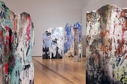
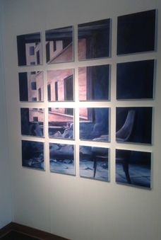
Another artist that intrigued me for a very different reason was John Folsom. The first thing that struck me about Folsom's work was his use of a grid in his large landscape paintings. The lines of the grid fade in and out, sometimes more pronounced than others. The work itself is created on a large panel, but the obscurity of the grid lines intrigues and even teases the viewer to come closer to investigate the picture plane. Upon closer inspection I realized that not only is the grid adhered to the surface of the work, but the work itself is not what it appears from a a distance. At first glance Folsom's work looks like large oil paintings. The truth is that Folsom prints large photos in a tile format that he pieces together on a large panel board. Once the pieces have been reassembled. Folsom paints on them to enhance the image. Sometimes he uses bright colors to emphasize particular areas, other times he uses subtle colors to create atmospheric affects. Once the work is compete he covers it with a coating of wax medium. 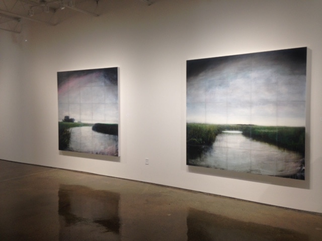 The atmosphere and perspective of Folsom's finished work truly draws the viewer in, and his techniques are perplexing. While I enjoy the finished look and feel of his work, I do't think the painter in me would ever find satisfaction simply painting on top of the photographic images. However, there is something about the use of the grid that really just intrigues me. While much of my recent work employs a grid in one way or another as a surface for my paintings, I must admit that the look and feel of Folsom's work tempts me to explore the possibility of painting a faux grid over the surface of a painting upon completion. This would really almost be reversing the process used by Folsom to create what I imagine to be a similar affect. Definitely a process worth considering further. 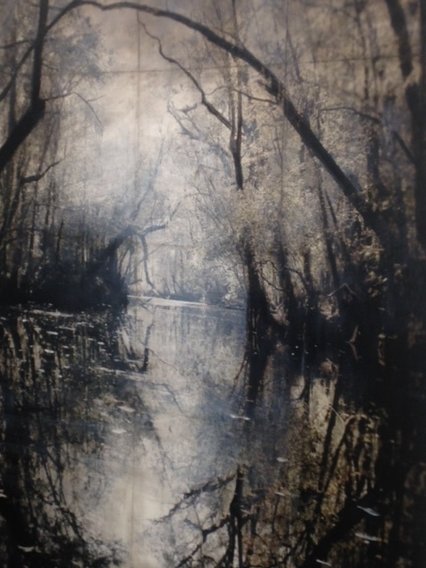 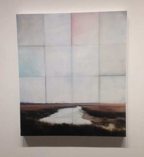 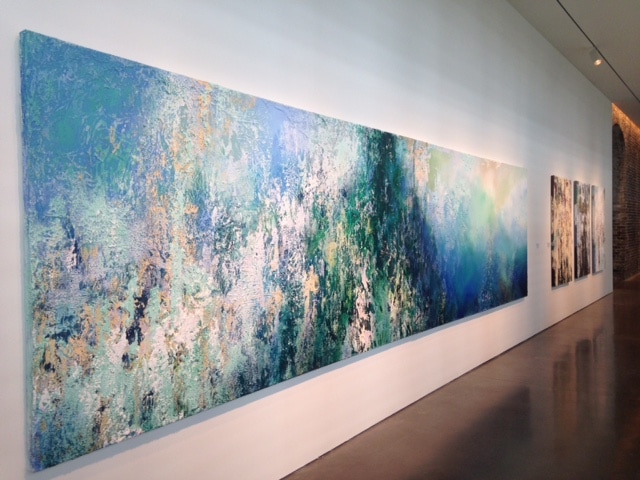 Last weekend I had the opportunity to visit the SCAD Museum and see the work of Jose Parla in person. I can't emphasize enough the difference it makes to see artwork in person as opposed to in a photograph, or on line. I keep going through pictures, both on line and on my camera to find some that really capture the feel of his work, but pictures just don't do them justice. What you can't see in even the best pictures is the heavy impasto and textures including broken pieces of stone and concrete that embellish both his paintings and his sculptural work. The textures add an element of depth and physicality to Parla's work that just doesn't translate in a photo.
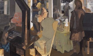
Parla's artistic roots go back to a childhood as a graffiti artist on the streets of Miami. Today his work sells for as much as a million dollars and adorn places like the world trade center in new York. Harkening back to his roots, his work is composed of many layers of color and texture that resemble city walls littered with posters, advertisements and graffiti. Using a variety of colors painted one over the other creates a visual noise that is reminiscent of the city streets he is representing. Parla also often includes layers of calligraphic lettering in his work. While the words are not legible, they are definitely beautiful and entice the viewer to explore a little more closely in order to figure out some sort of secret. The elegant curves of his work compliment the thick layers and hard textures. Seeing the textures in Parla's work first hand was a real treat, especially since I have been experimenting some with the use of impasto in my own work. I enjoy building up modeling paste on the surface of my work, but worry about keeping a balance so the texture doesn't overtake the painting. 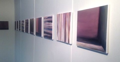 One of my recents works using some texture. In contrast to Parlas' work, I have also recently been exposed to the work of painter Susan Lichtman. Lichtman uses a very limited palette to create her colors and values, and often limits the values as well except for emphasis. She uses what she calls "red herrings" in her choice of value and color. By this I mean that she paints most of the painting in a very limited value range and emphasizes a few surprise areas with bright values and colors. She typically like to keep the actual figures somewhat obscured so the viewer slows down to move through the painting. You are drawn in by the highlighted area, and led to explore the dark to see what else is happening. 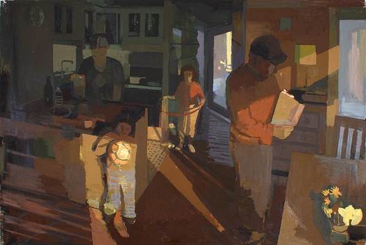 Lichtman works both from life and from memory to create fictitious interior narratives. She refers to them as fictitious because they are based on people who have come and gone from her home, but the scenes she depicts have never actually happens. Often she will even us blurred lines to imply movement and the passage of time in her work.
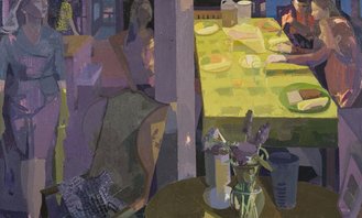
Lichtman paints areas of flat color with values strategically placed beside each other to create a sense of depth and movement that is quite surprising under such constraints. Surprisingly she starts her paintings focused on a small detail, typically a still life that interests her and builds the composition around that, working specific to general as opposed to the way most artists work - general to specific. I think one of the things that draws me most to Lichtman's work is that it seems to be about the mundane. Simple spaces of everyday life approached in a simple way that draws the viewer in to make them want to know more of the story. While Lichtman uses a figurative narrative in her work, I prefer to simply allow the viewer to consider the space itself and bring to it whatever preconceived ideas they may have, and consider whatever narrative they may begin to imagine. All of these concepts seem to be in stark contrast to Jose Parla's work, but I am intrigued but both artists none the less.
|
Cyndy EppsWorking on my MFA in Studio Art at Georgia Southern has taught me the importance of understanding not only what I am doing as an artist, but also what other artists are doing, and how that can impact my artwork. Archives |
 RSS Feed
